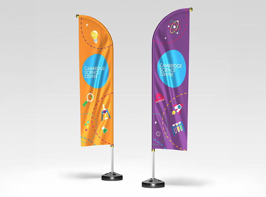
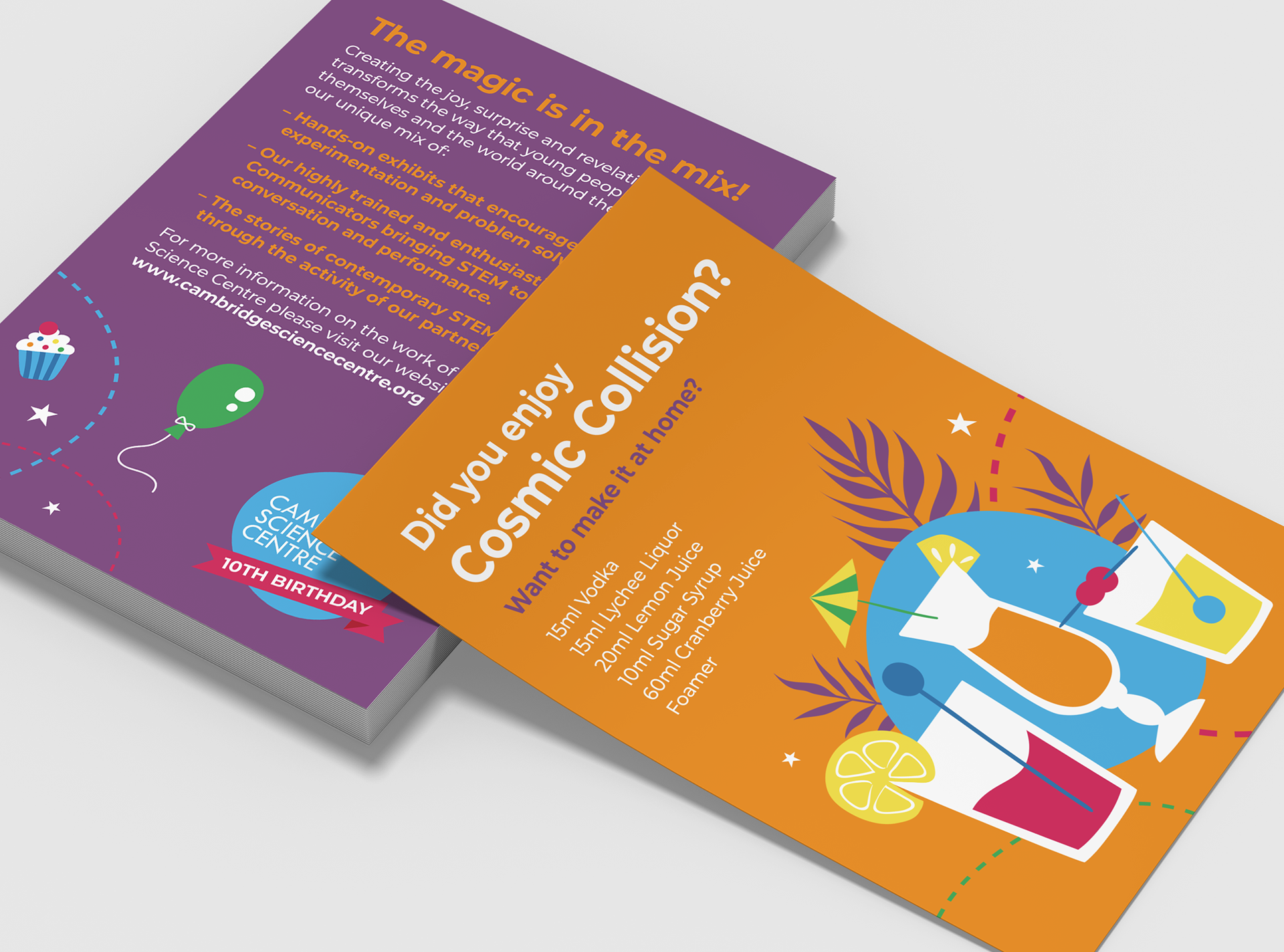


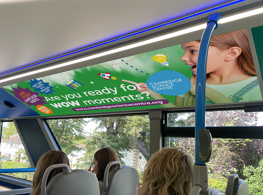

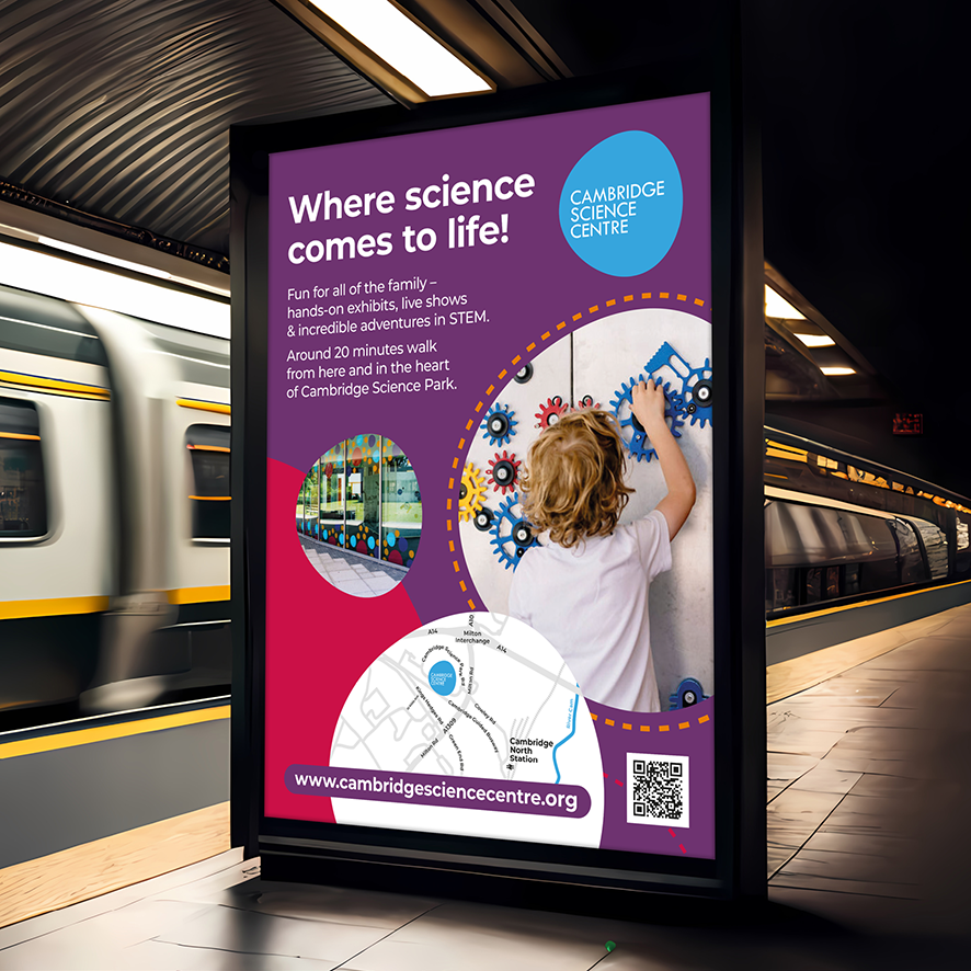

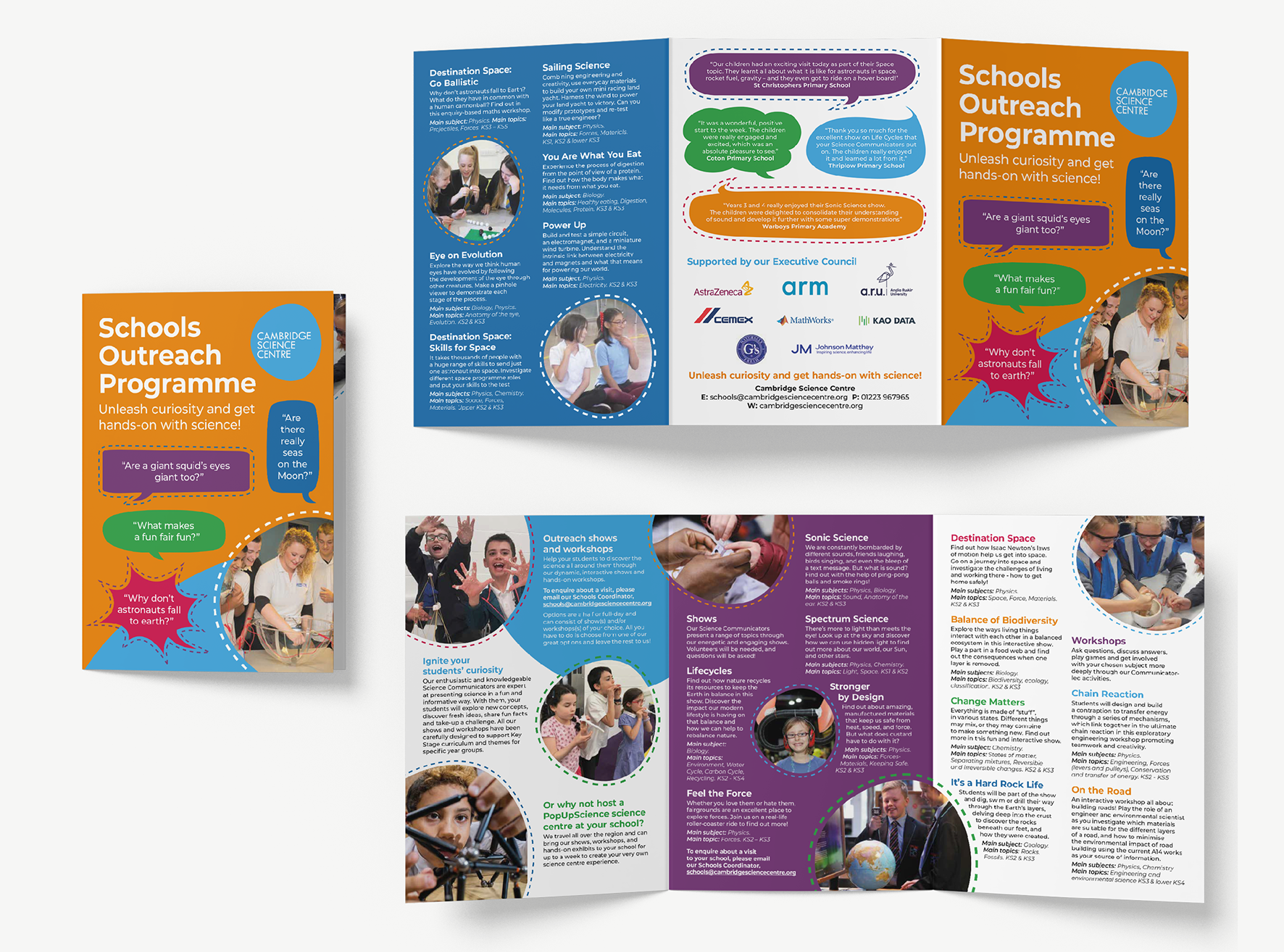
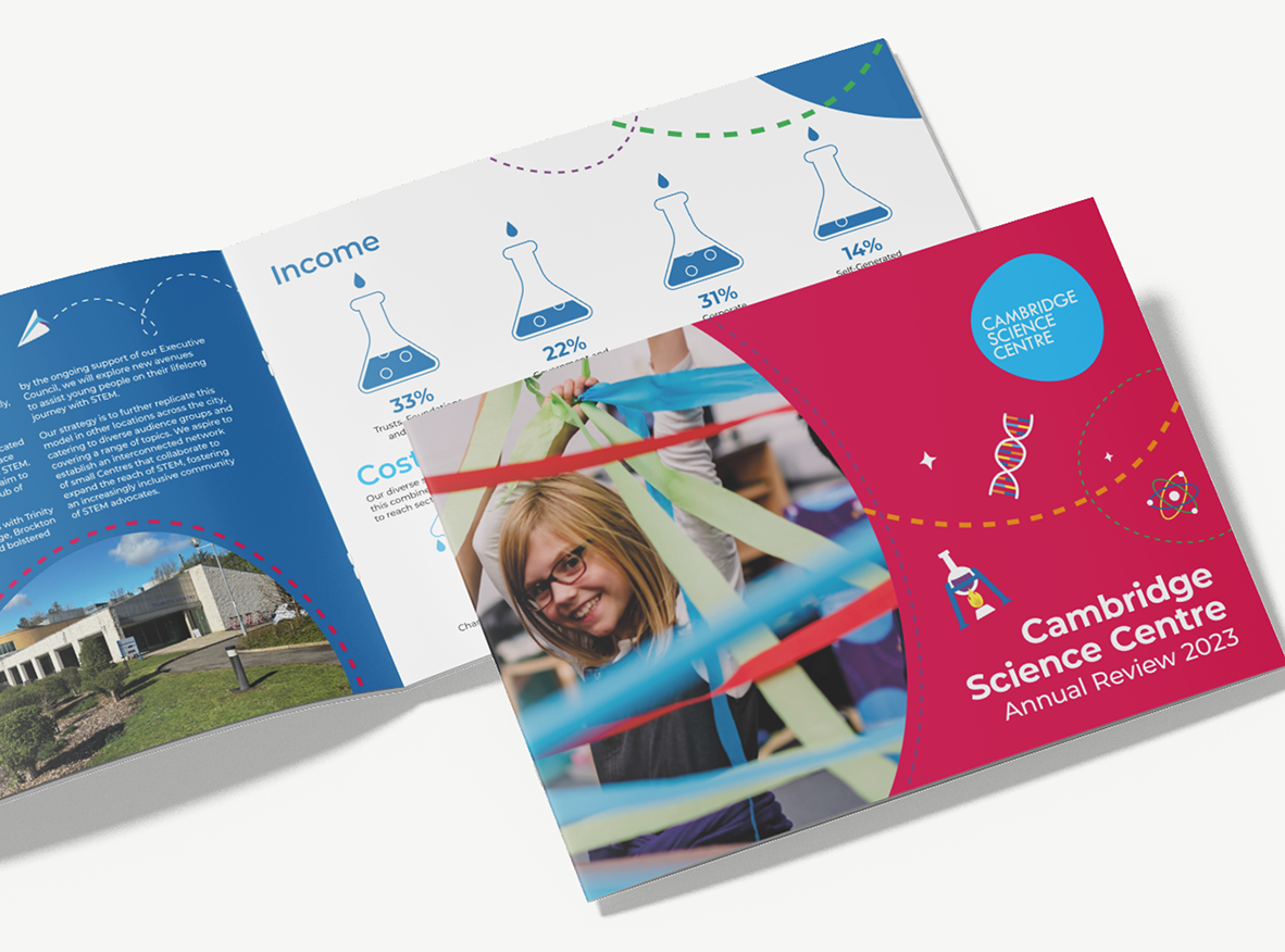
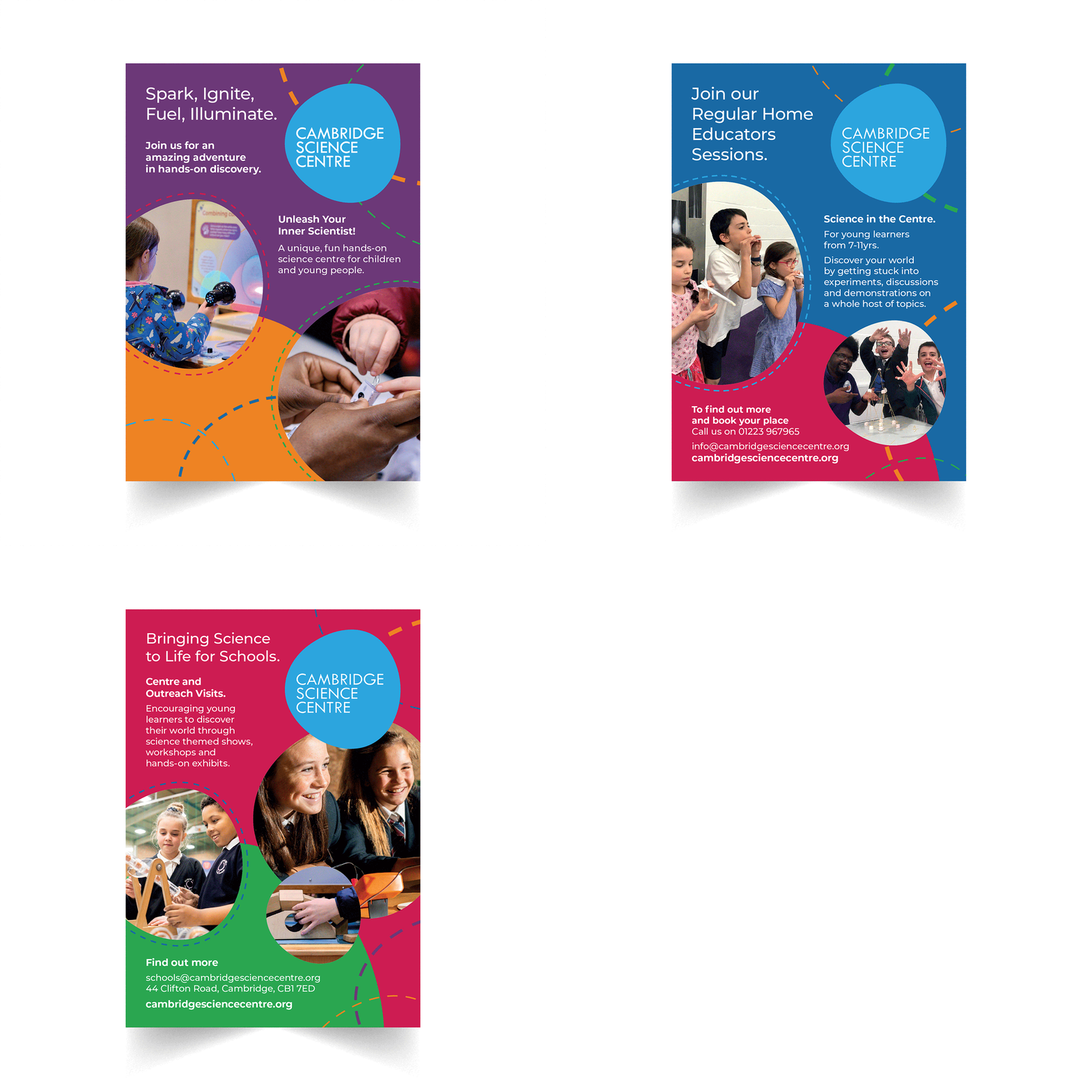


Challenge: Cambridge Science Centre was relocating to a new building and needed to build awareness, excitement and clear wayfinding for its new location. The challenge was to create a distinctive visual approach that would engage children aged 7–14 and work consistently across physical, outdoor and print communications. Solution: I developed brand guidelines using five bold colours alongside the Centre’s light blue logo, supported by a playful suite of bespoke STEM-inspired icons. I applied the graphics across window vinyls, outdoor banners, entrance flags, bus and train station advertising, and portable outreach totems. Branded brochures, flyers and annual reports created a cohesive and recognisable campaign across every touchpoint.