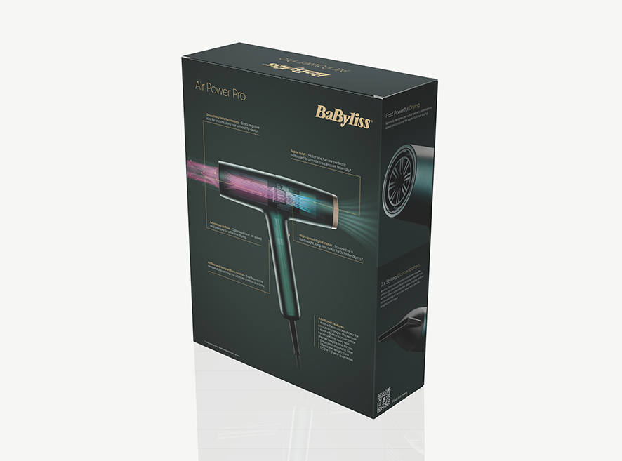

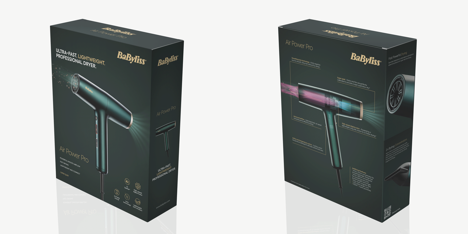
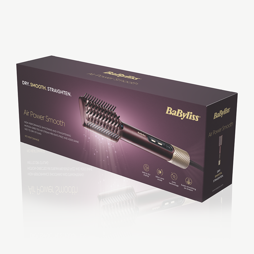

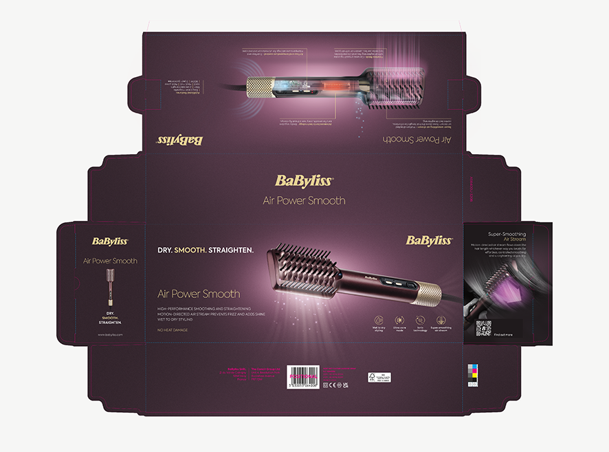
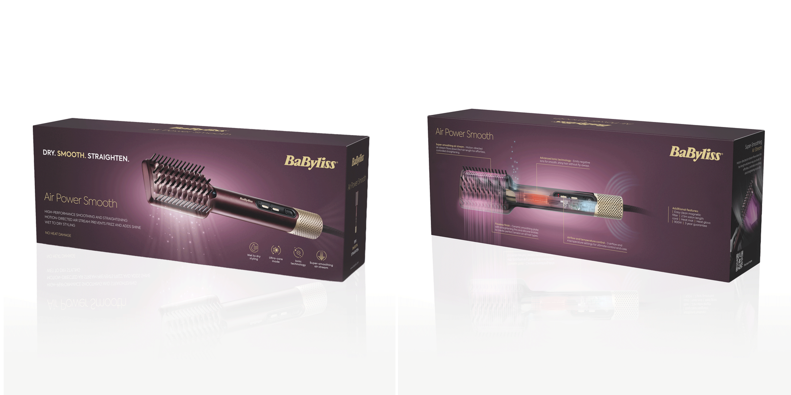
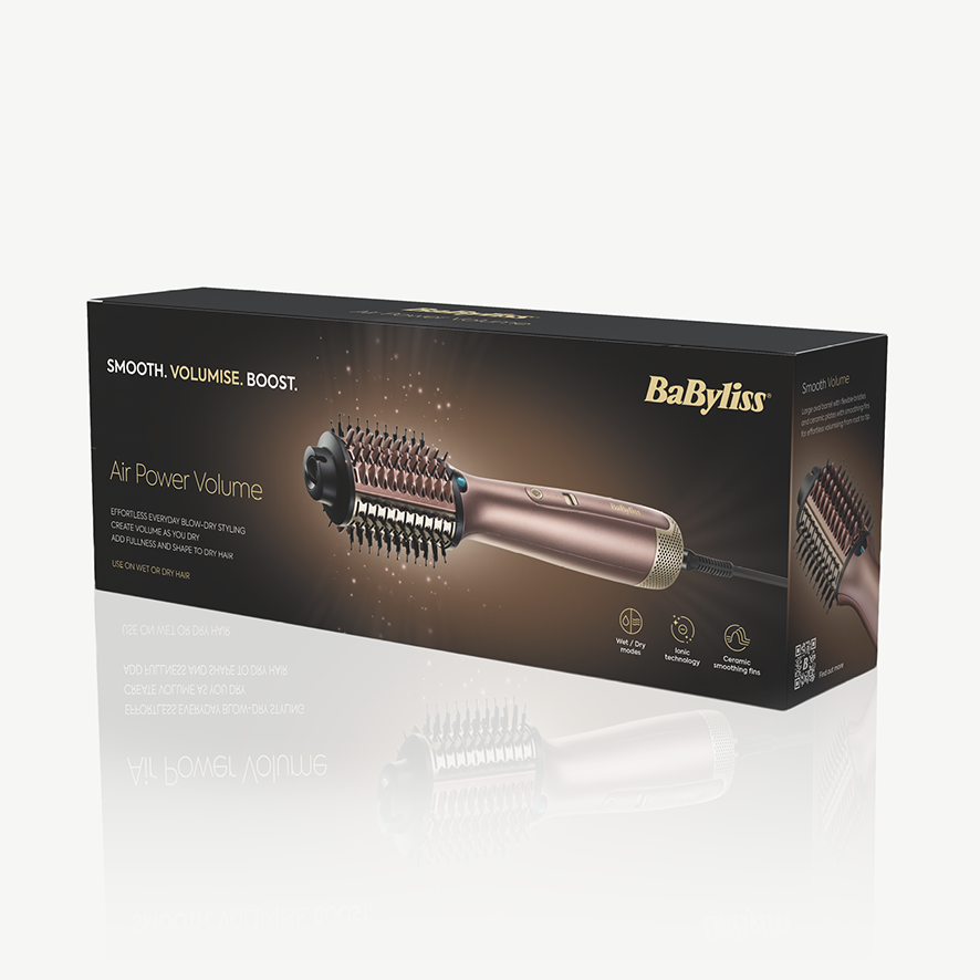
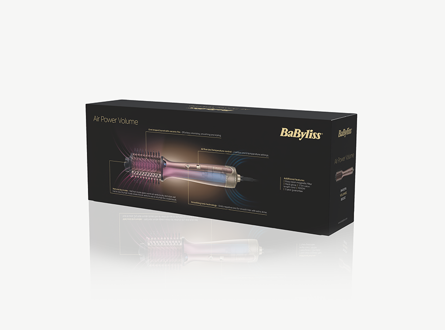

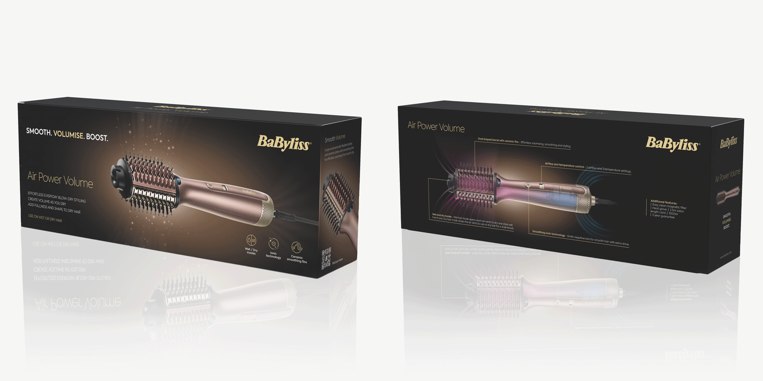
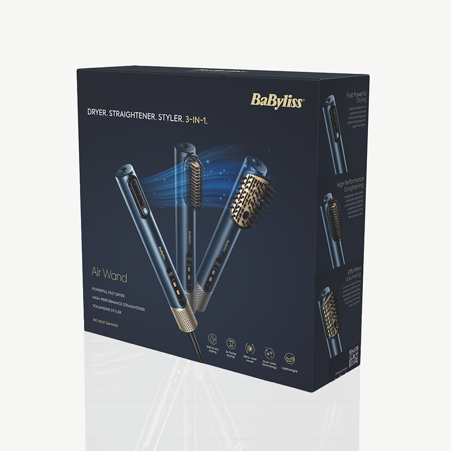
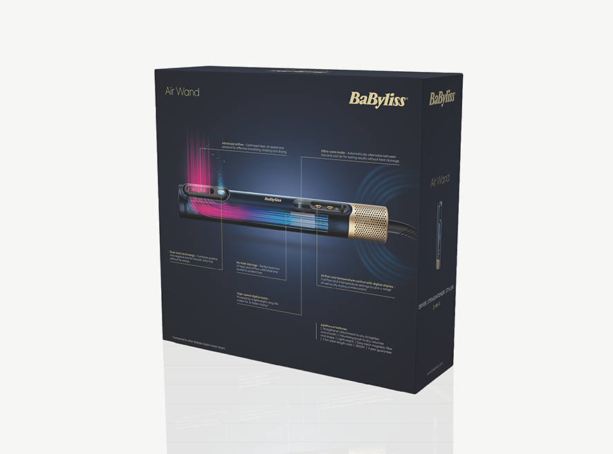
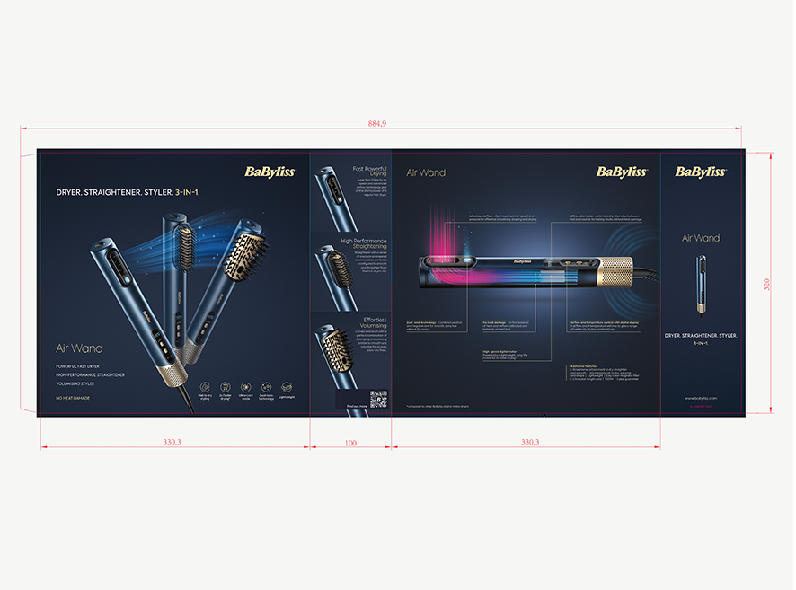
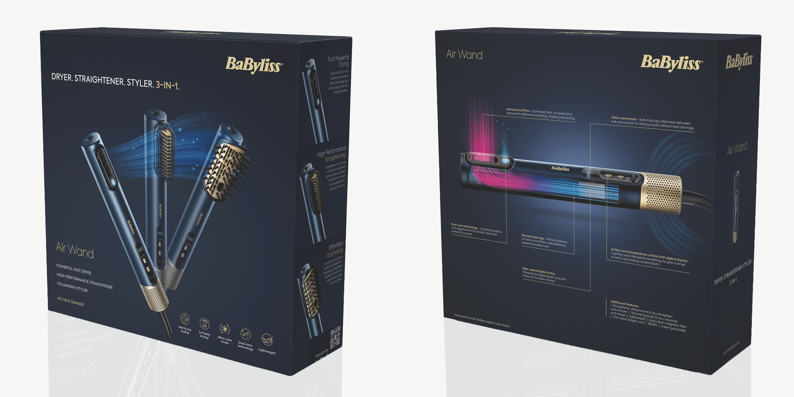
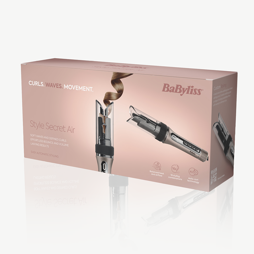
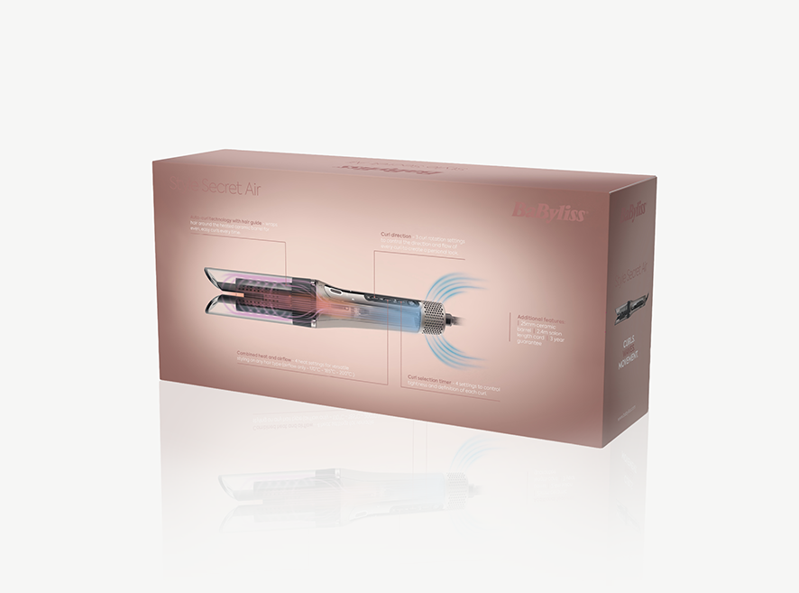
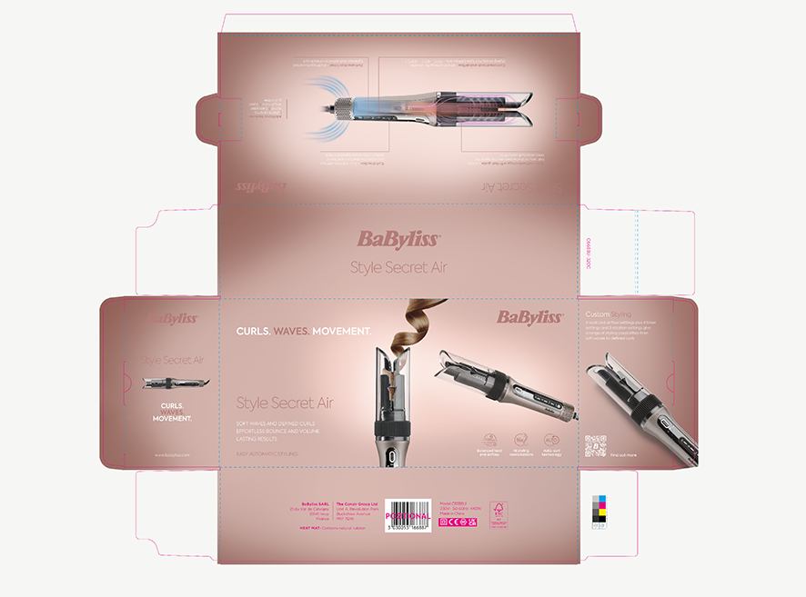
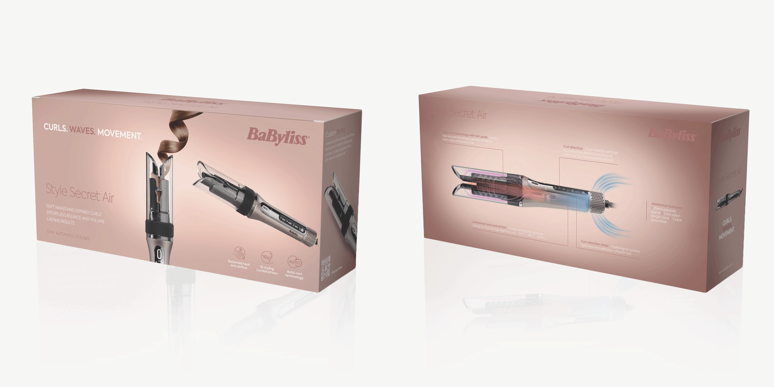
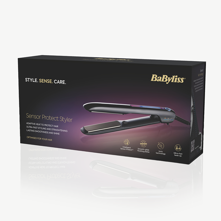
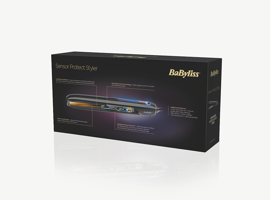

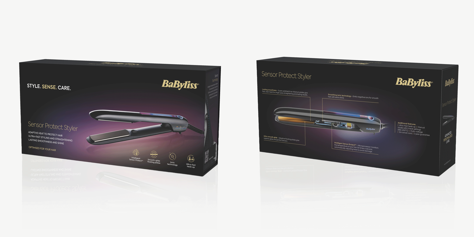

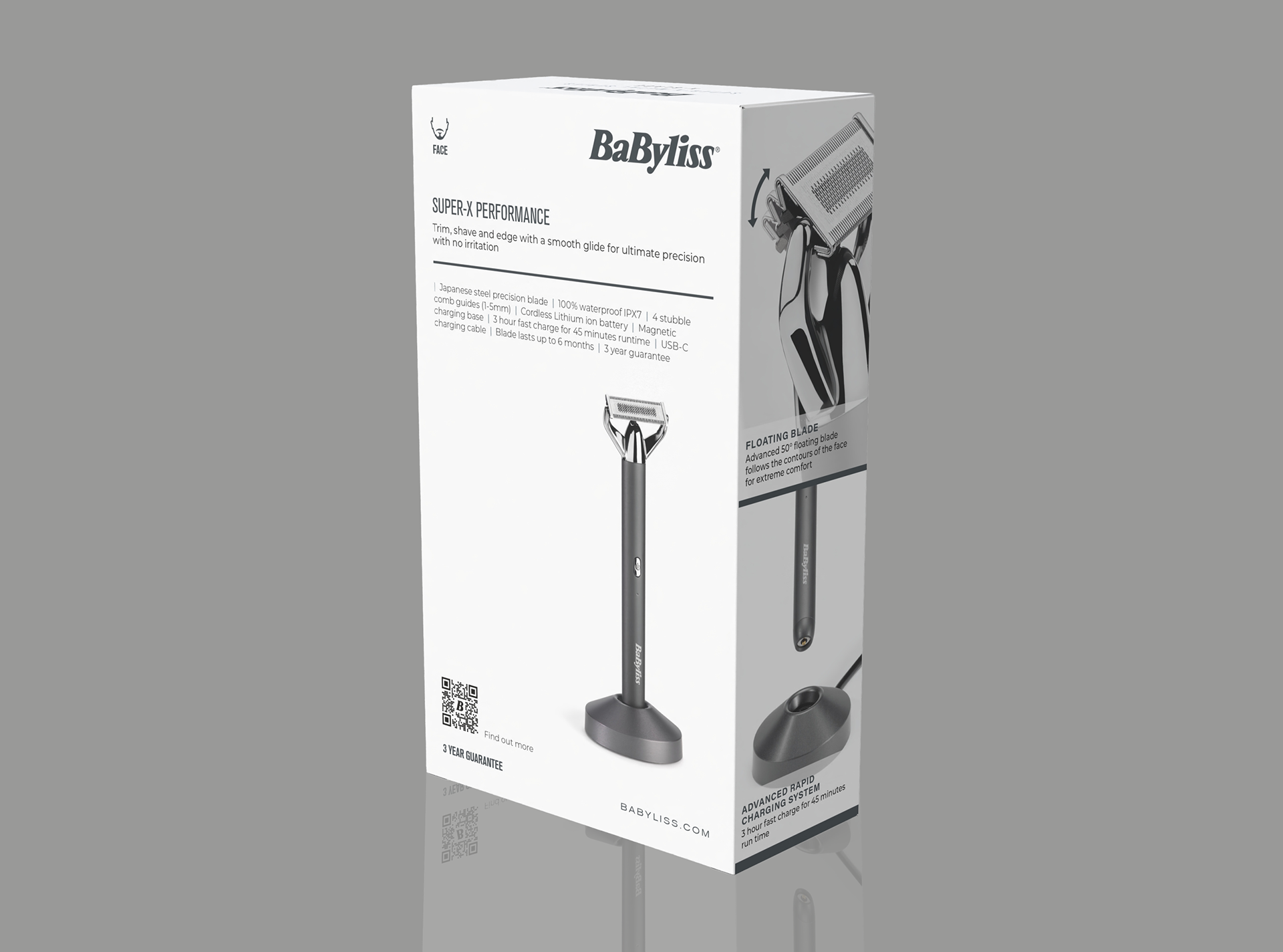
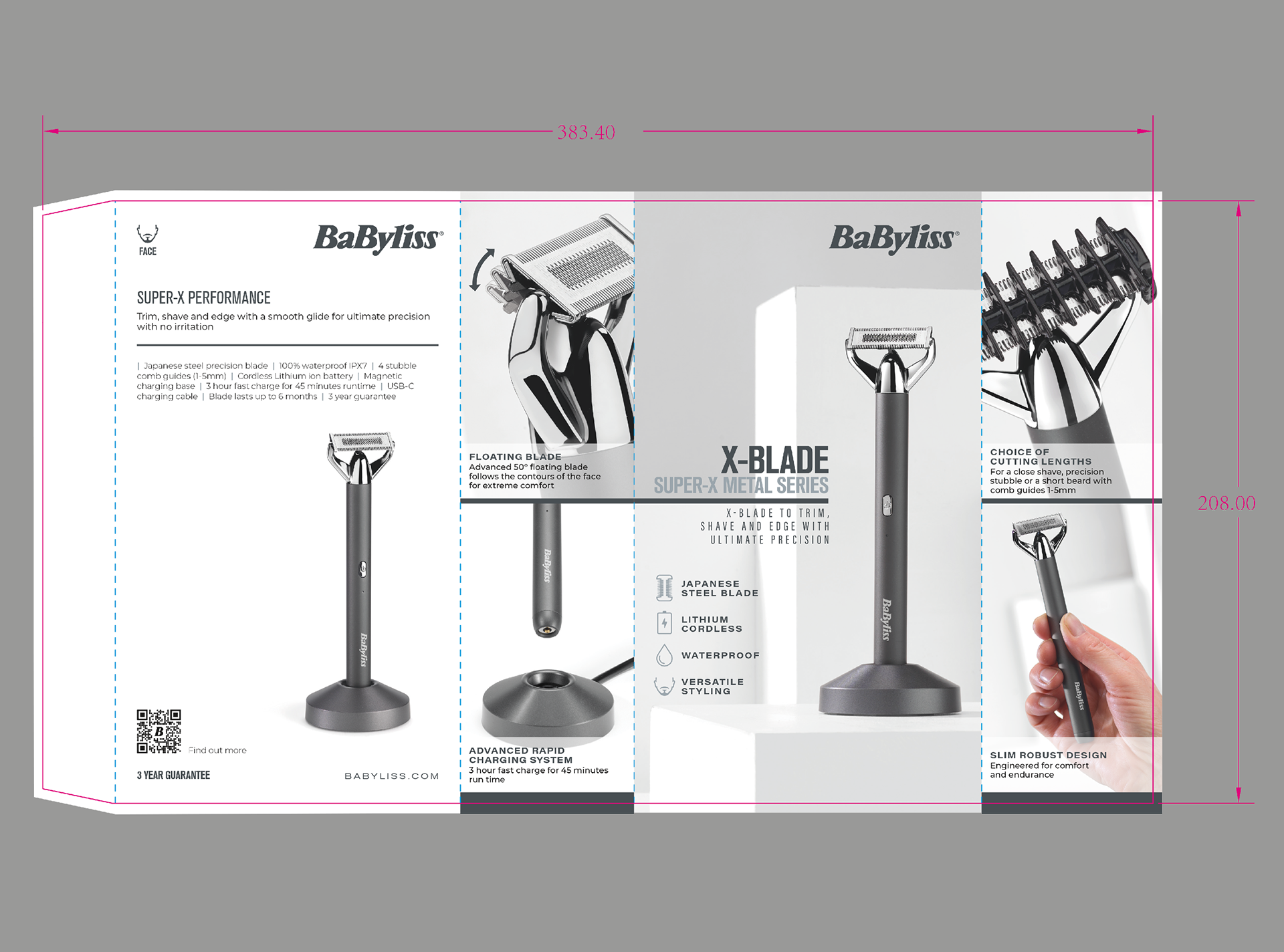
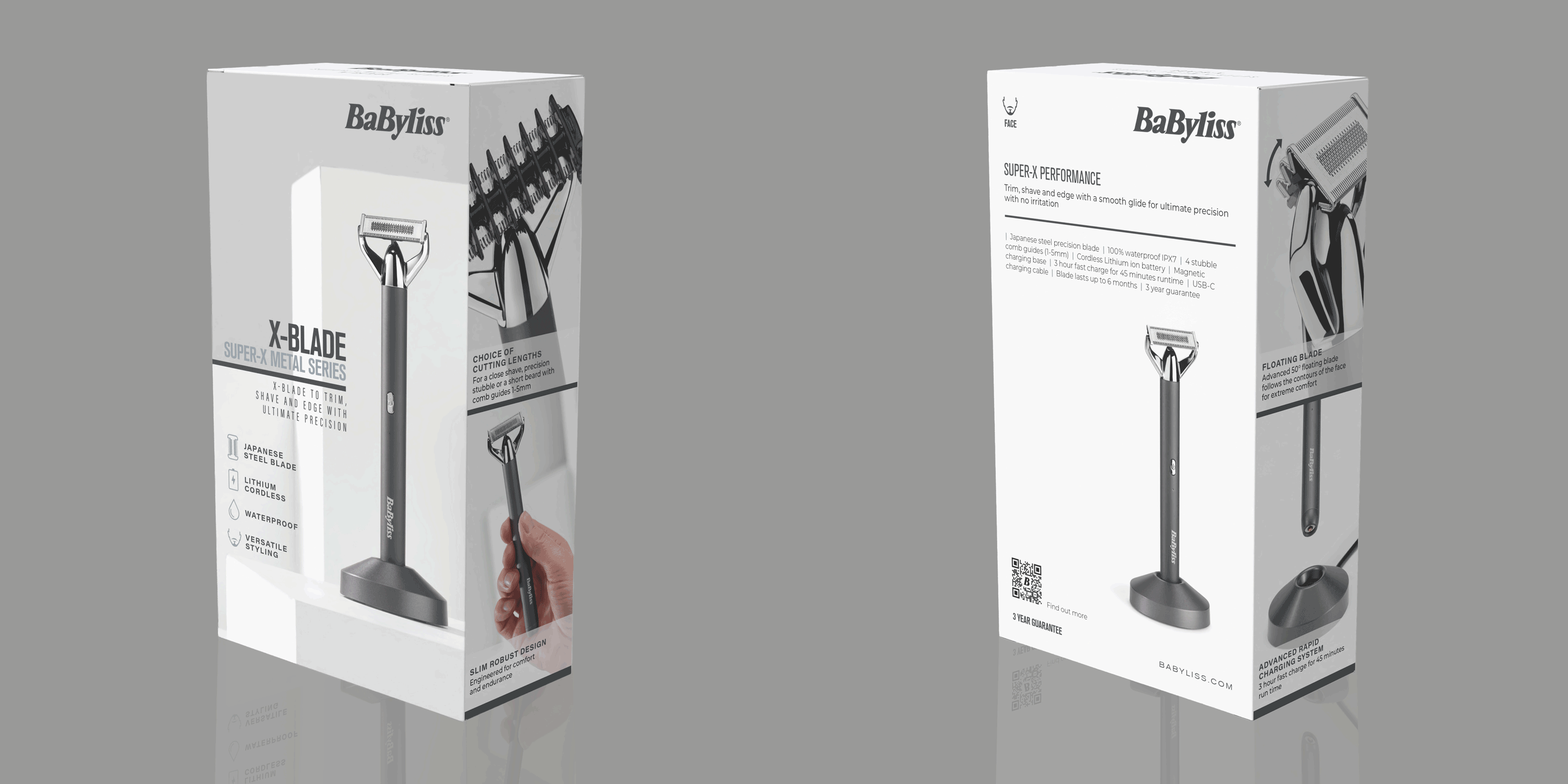


Challenge: Babyliss needed to reinvigorate seven haircare and grooming packs for relaunch across the Asia Pacific market. The existing packaging required an overall design overhaul, including updated and corrected artwork, while creating greater visual consistency across a range of different pack shapes, sizes and colours. The challenge was to ensure each product retained its own identity while clearly belonging to the same cohesive range. Solution: Working as part of a team of three designers, I helped redesign and develop seven packs across five language iterations, including Traditional Chinese, Thai, Japanese, Korean, Malay and Vietnamese. We created a unified range aesthetic through consistent typography, considered type placement, clean layouts and generous use of space, while allowing each pack to feel distinctive. Gold foil was applied to product names and feature icons to add a premium finish, highlight key product benefits and reinforce the premium positioning of the range.